Telling stories with data using the grammar of graphics
Different types of graphs may, at first glance, appear completely distinct. But in fact, graphs share many common elements, such as coordinate systems and using geometric shapes to represent data. By making different visual choices (Cartesian or polar coordinates, points or lines or bars to represent data), you can use graphs to highlight different aspects of the same data. For example, here are three ways of displaying the same data:
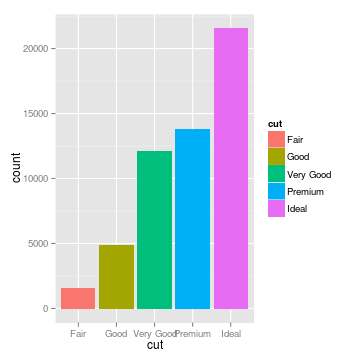
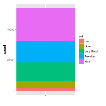
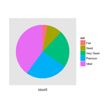
The pie chart focuses the reader on large percentages, and encourages the reader to think of the total (here, the cut of different diamonds) as a finite quantity that is being apportioned to different groups. The stacked bar plot provides the same information, but makes it easier to accurately gauge how large each category is. The histogram splits the categories horizontally, and draws attention to how the categories are ordered. It encourages the reader to think about the distribution rather than disconnected categories, and provides a sense of scale.
We often talk about types of graphs – bar plots, pie charts,
scatterplots – as though they are unrelated, but most graphs share
many aspects of their structure. We can think of graphs as visual representations of (possibly transformed) data, along with labels (like axes and legends) that make the
meaning clear. Much like the grammar of a language allows you to combine words into meaningful sentences, a grammar of graphics provides a structure to combine graphical elements into figures that display data in a meaningful way. The grammar of graphics was originally introduced by Leland Wilkinson in the late 1990s, and was popularized by Hadley Wickham with ggplot, an R graphical library based on the
grammar of graphics. I started using ggplot a few years ago. The syntax felt foreign for a long time, so I decided to learn about the theory behind the grammar, to get an intuition for the concepts underlying the code. Understanding this theory helped me understand ggplot and think more deeply about graphics, and I hope this introduction does the same for others. ggplot is the best-known implementation of the grammar, but thanks to its success, it is being implemented in a variety of languages, including
Python, Julia, and D3, but I’ll be using R code for purposes of illustration here.
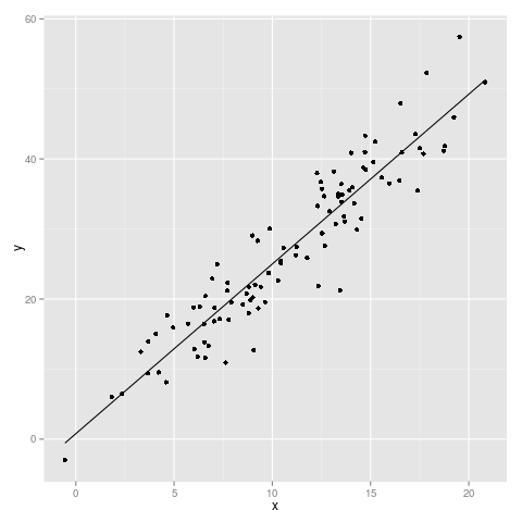
In the grammar of a language, words have different parts of speech, which perform different roles in the sentence. Analagously, the grammar of graphics separates a graphic into different layers. These are layers in a literal sense – you can think of them as transparency sheets for an overhead projector, each containing a piece of the graphic, which can be arranged and combined in a variety of ways. But what is in a layer? Let’s think about an example. Say we have a dataset with an independent variable, x, and a dependent variable, y. If we perform a simple linear regression, we can also calculate the predicted values for y at specific values of x (we can call these predictions y’). Using these data, we want to make a scatterplot with a line of best fit. What are the elements of this plot?
We have:
- The data itself (x, y, and the best fit prediction, y’)
- Dots on the scatterplot representing the relationship between x and y
- The line representing the relationship between x and y’ (the line of best fit)
- The scaling of the data (linear)
- The coordinate system (Cartesian)
What if we want to make a histogram of the distribution of x? Then we have:
- The data itself (x)
- Bars representing the frequency of x at different values of x
- The scaling of the data (linear)
- The coordinate system (Cartesian)
Clearly there are many similar components between these graphs, and for most graphs, these elements do a pretty good job describing what a plot will look like. These are our “parts of speech”, the pieces of a graphic that we can use to tell a story. So let’s look at each one of them and try to understand what they do.
Data
Before it’s possible to talk about a graphical grammar, it’s important
to know the format of the data you’re working with. After all, it
contains all of the information you’re trying to convey. The grammar
speaks in terms of data as “tidy” rows of individual observations. Here’s
a sample of data in this format, taken from ggplot’s sample dataset
diamonds.
##   carat       cut color clarity depth table price
## 1  0.23     Ideal     E     SI2  61.5    55   326
## 2  0.21   Premium     E     SI1  59.8    61   326
## 3  0.23      Good     E     VS1  56.9    65   327
## 4  0.29   Premium     I     VS2  62.4    58   334
## 5  0.31      Good     J     SI2  63.3    58   335
## 6  0.24 Very Good     J    VVS2  62.8    57   336
Here, each row represents observations of a single diamond. This seems like an obvious format, but not all datasets have this structure by default. Count data can be stored as a matrix. For example, you might imagine a matrix of locations and the number of birds spotted there:
##        cardinal blue jay chickadee
## site_1        5        0         1
## site_2        4        0         2
Here, each matrix element, rather than each row, represents a single
observation. Using the package
reshape2, we can
transform the matrix into a format that is compatible with the
grammar. In this case we transform the matrix into a list of
observations and store the value in the new column count.
require(ggplot2)
require(reshape2)
reshape2::melt(birdmat, value.name = "count")
##     Var1      Var2 count
## 1 site_1  cardinal     5
## 2 site_2  cardinal     4
## 3 site_1  blue jay     0
## 4 site_2  blue jay     0
## 5 site_1 chickadee     1
## 6 site_2 chickadee     2
Other representations of data include summary tables, or
the storage of different columns in different variables. ggplot is
fairly picky about data formatting, but in return it gives us the
power to make significant changes to how we are plotting the data
without changing the data object itself. To understand the grammar of
graphics, it helps to think of the one-observation-one-row dataset as
a fixed entity that we can view in different ways.
Geoms
The most obvious part of a graph is the visual display of the data
itself. This is often a basic geometric object like a point, line, or
bar, so in ggplot, each of these elements is called a “geom”. You
can display multiple pieces of information by layering geoms
(scatterplot layer + line of best fit), or you can explore the same
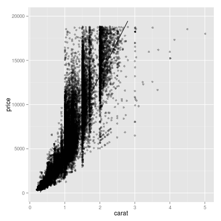
data by visualizing it with different types of geoms.
## fit a linear regression for the relationship between carat and price
## the "fitted" column here is calculating the predicted price for
## each value of carat.
diamonds$fitted <- lm(price ~ carat, data = diamonds)$fitted
## ggplot can actually fit simple models like a linear regression
## using geom_smooth(). Since this only works for a limited set of
## models, I prefer to do the model fitting outside of the plotting.
g <- ggplot(data = diamonds, aes(x = carat, y = price)) +
    geom_point(alpha=.3) + geom_line(aes(y = fitted)) +
    scale_y_continuous(limits = c(0, 20000))
plot(g)
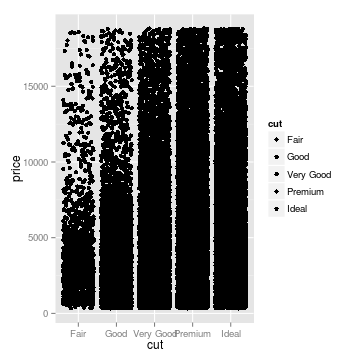
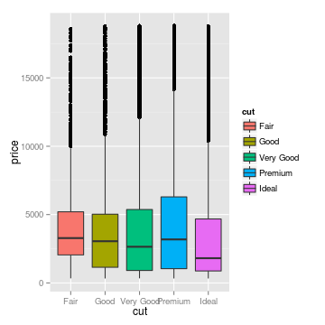
## three ways of looking at the distribution of diamond price,
## conditional on the quality of the cut
g <- ggplot(diamonds, aes(x = cut, y = price, fill = cut))
## jittering the points helps prevent overplotting
gjitter <- g + geom_jitter()
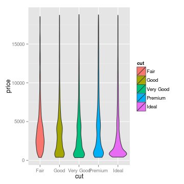
## box and whiskers plot
gbox <- g + geom_boxplot()
## a fancier version of the boxplot, which shows the whole distribution,
## not just quantiles
gviol <- g + geom_violin()
Scaling
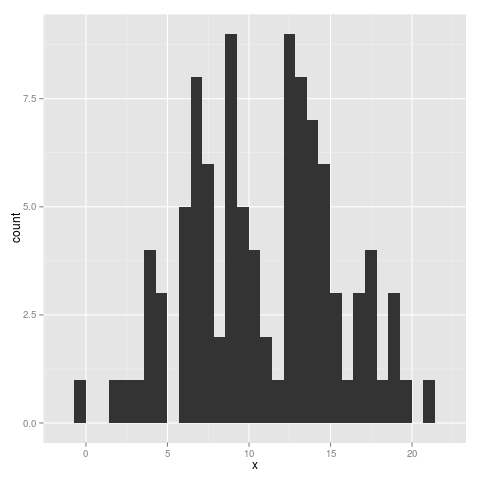
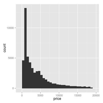
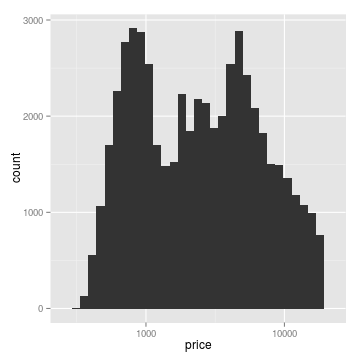
Sometimes it’s useful to transform or rescale data. Our eyes are good at seeing linear relationships, so if a relationship is log-linear, it makes sense to simply change the scale. Similarly, it is common to fit a regression line to log-transformed data, and it makes sense to plot this as a linear relationship, rather than plotting a curved fit on a linear scale. The same logic applies for other transformations. In the example below, the distribution looks close to unimodal (that is, it has a single peak) until we log-tranform it. I like to think of this as a transformation of our view of the data, rather than a transformation of the dataset itself. Thinking about the dataset as a fixed entity, it makes sense to apply transformations while plotting rather than altering the dataset itself.
# define linear histogram
g <- ggplot(data = diamonds, aes(x = price)) +
    geom_histogram()

# apply lograrithmic scale
g2 <- g + scale_x_log10()
Coords
We’re very used to thinking using the Cartesian coordinate system, but sometimes polar coordinates make sense. Pie charts are a common (albeit controversial) use of polar coordinates, and there are other flashy graphics that use them. You may also want to use a map projection, or flip the coordinates for a horizontal bar graph rather than a vertical one.
flip <- ggplot(data = diamonds, aes(x= cut, fill = cut)) +
    geom_histogram() +
    coord_flip()
plot(flip)
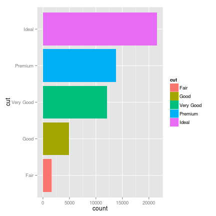
Polar coordinates can sometimes be misleading or confusing to the eye, but if your data are fundamentally cyclic rather than linear in nature, it’s a useful option to have.
Groups and Facets
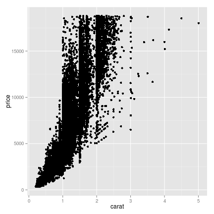
Facets are a way to split data into subplots based on another factor in the data. In my opinion, facets are one of the most compelling reasons for using the grammar of graphics. Let’s say we’re looking at diamond carat versus diamond price. This is pretty easy to plot in most programming languages.
## base R
plot(diamonds$carat, diamonds$price, type = 'p')
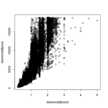
## ggplot
g <- ggplot(diamonds, aes(x = carat, y = price)) + geom_point()
plot(g)
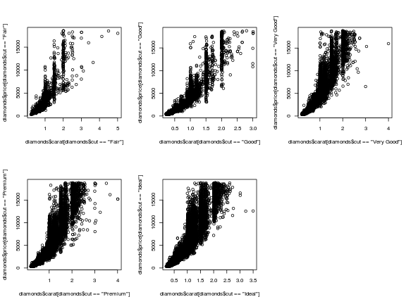
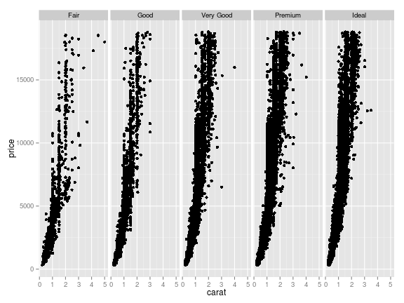
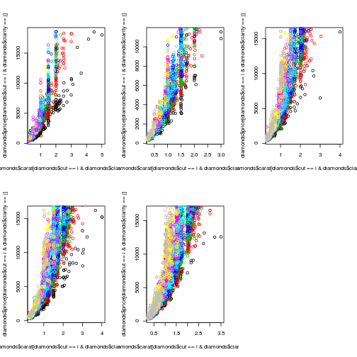
But we also have information about the cut. Bigger, heavier diamonds
probably cost more, but not if they’re cut poorly. So we can create different
plots for each cut, to tease out this relationship. In base R, you would
have to write out separate commands for each cut. Basically, each cut
category gets treated as an entirely separate dataset, and each plot
as a separate unit. But using the grammar of graphics, the facet is
simply another layer to apply to one dataset. Look at how much nicer
the ggplot code (and output!) looks:
## base R
par(mfrow = c(2,3)) ## sets up multi-plot window
## plot each facet separately
## also notice that we have to specify the axes limits for x using
## xlim, or the plots would be differently scaled
plot(diamonds$carat[diamonds$cut == 'Fair'],
     diamonds$price[diamonds$cut == 'Fair'], type = 'p',
     xlim = c(0,5))
plot(diamonds$carat[diamonds$cut == 'Good'],
     diamonds$price[diamonds$cut == 'Good'], type = 'p',
     xlim = c(0,5))
plot(diamonds$carat[diamonds$cut == 'Very Good'],
     diamonds$price[diamonds$cut == 'Very Good'], type = 'p',
     xlim = c(0,5))
plot(diamonds$carat[diamonds$cut == 'Premium'],
     diamonds$price[diamonds$cut == 'Premium'], type = 'p',
     xlim = c(0,5))
plot(diamonds$carat[diamonds$cut == 'Ideal'],
     diamonds$price[diamonds$cut == 'Ideal'], type = 'p',
     xlim = c(0,5))
## ggplot
## we can just reuse 'g' from the previous example, and add facetting
## also note that ggplot keeps identical axis limits for all facets,
## because it's treating the facets as parts of a single dataset
g <- g + facet_grid(. ~ cut)
plot(g)
Now let’s say we also want to split the data by clarity. Having each cut-clarity combination get its own separate plot would be a lot of plots, so let’s color the points by the level of clarity. Base R treats each point color as a different set of points, and each subplot in the window as a separate unit. But color is like an adjective in the grammar: an aesthetic element which modifies the other layers.
## base R
## set up subplot window
par(mfrow = c(2,3))

## we can make things more concise by looping
for(i in levels(diamonds$cut)){
    ## color number for points
    colnum <- 1
    for(j in levels(diamonds$clarity)){
        ## for each new plot, the first call need to create the plot
        ## Otherwise we layer on points
        if(colnum == 1){
            plot(diamonds$carat[diamonds$cut == i & diamonds$clarity == j],
                 diamonds$price[diamonds$cut == i & diamonds$clarity == j],
                 type = 'p', col = colnum, xlim = c(0,5))
        } else {
            points(diamonds$carat[diamonds$cut == i & diamonds$clarity == j],
                   diamonds$price[diamonds$cut == i & diamonds$clarity == j],
                   col = colnum)
        }
        colnum = colnum + 1
    }
}
## ggplot
## The only change we need to make is to add an aesthetic in ggplot()
g <- ggplot(diamonds, aes(x = carat, y = price, colour = clarity)) +
    geom_point() + facet_grid(. ~ cut)
plot(g)
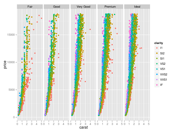
Run ggplot code in r-fiddle (the base R code is clunky enough that it doesn’t run well on r-fiddle)
Clearly, the base code is clunky and verbose next to the ggplot
version. With a grammar to work with, we can communicate our intentions
to ggplot in a clearer, more concise way. To anthropomorphize heavily,
Base R graphics happily plots data, but it doesn’t “understand”
anything about how data are structured. If you want to split your data
into groups by a another
variable, you have to tell it specifically what to do with each data
chunk; it doesn’t understand what “split by another variable”
means. But the grammar of graphics provides a common language between
the computer and the user. ggplot understands the concept of a
dataset, and how its rows and columns are related. It understands that
a pie chart and a stacked bar chart are the same plot with different
coordinate systems. It understands the idea of faceted plots as a
single visual unit. And most importantly, it makes those ideas and
relationships visible to the user, to make it simple to switch between
different visual elements to represent the data.
Communication is the core idea at work here. When you have a structured language for graphics, it’s a lot easier to think and talk about them. It’s a great mental framework for when you’re trying to decide how to display data for yourself or for a presentation. If you aren’t sure how you want to display your data, it provides a concise, consistent way to move between different possible representations.
Making graphical choices
Choices of geometry matter. Points suggest that each data point is its own unit, independent of or distinct from the other points. Lines highlight the relationship between data points, rather than the points themselves. Similarly, bars, rectangles, and distributions emphasize that data points are parts of some larger category, and we are using the data to estimate the size or spread of that category.
This is why I find it useful to plot my data multiple ways before I present it to others. What do I learn from each plot? What information is excluded or difficult to see? How much detail am I providing, relative to what my audience needs to understand? What I find so powerful about grammar of graphics-style plotting is that, once my data are properly formatted, it is easy to slice, group, and facet my data in a variety of ways, swapping between geoms and aesthetics to explore my data. It’s not just a syntax but a different way to think about data, and a powerful tool for exploration and understanding.
Further Reading
-
The Grammar of Graphics, Leland Wilkinson.
-
ggplot2: Elegant Graphics for Data Analysis, Hadley Wickham.
-
The Visual Display of Quantitative Information, Edward Tufte.